 Skip to content
Case study · Websites · UK charity · With Creative & Commercial
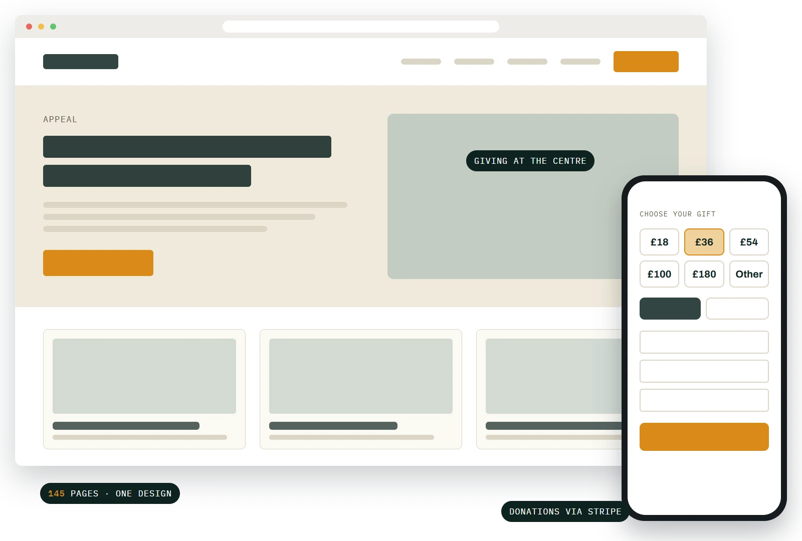
A UK charity whose website had grown one appeal at a time, over years of campaigns, events and dinners. Working as digital lead with the creative agency Creative & Commercial, the job was to bring all of it into one consistent site, with giving at the centre.
The numbers
145
pages rebuilt in one design
75
gallery stories of dedications, events and dinners, back to 2018
5
new programme pages, one with its own donation form
9
months, January to September 2026
Figures from the live site, November 2026. Client anonymised.
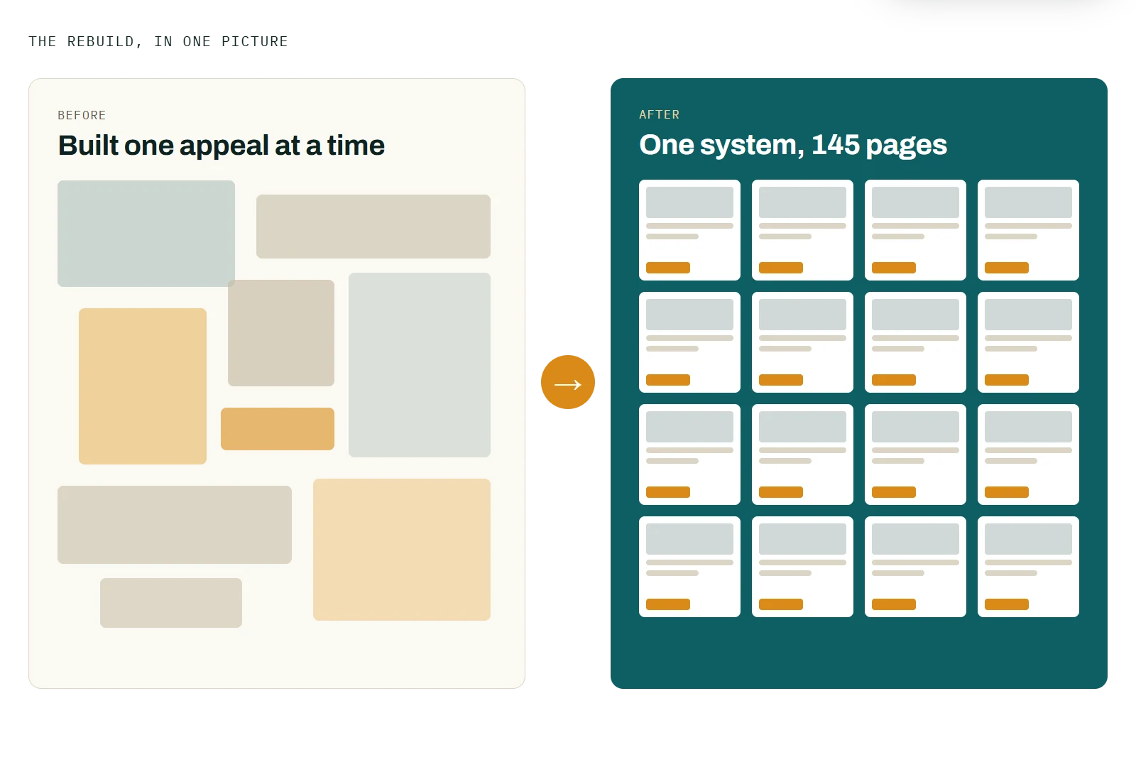
The site had grown page by page. Layouts varied from one section to the next, the photo archive was hard to browse, and newer programmes, including one for younger supporters, needed pages of their own.
Over nine months we rebuilt all 145 pages in one design, moved the news archive across, and rebuilt the gallery around dedications, events and dinners going back to 2018. Five programmes got new pages, including a children's giving scheme with its own donation form, paid through Stripe. Newsletter sign-ups now go straight into Mailchimp, tagged by where they came from, and events are tagged so each page shows only the ones that belong to it.
Every page now looks and works the same way, so a supporter can move from a story to a donation without the site changing under them. New appeals, events and dedications slot into a structure that already exists, rather than becoming another one-off page.
Tell us what it needs to do, and we will tell you what we would change first.
Start a conversation